Re-design of Pinterest's User Experience

Responsibilites:
User Research, Design Thinking, Information Architecture
Tools:
Figma, Mural
Duration:
2 months
Role:
Sole Designer
Project Overview
Pinterest is a web & mobile application that is widely used by creators, artists and anyone looking for some visual inspiration. Pinterest describes themselves as "a visual discovery engine for finding ideas like recipes, home and style inspiration, and more". As a regular Pinterest user, I've noticed many flaws in the user experience of the web application such as the main feed auto-refreshing or not being able to save multiple pins from a board. This project walks through the flaws in the current user experience of the existing website based on personal experience and user research but also proposes solutions to these flaws.


The Problem
The current website lacks organization and key functionalities. Some common problems users are facing are having a feed unrelated to the user's existing boards and saved pins, ads taking over the user's feed, and uncontrolled refreshing of the feed.
User Feedback on Current Pinterest Website
To understand some other pain points that users were facing with Pinterest, I came across this Reddit thread where many regular Pinterest users were sharing things they disliked about Pinterest's user experience. Below I've captured just a few of the common frustrations among several users.
"The main feed randomly refreshing"
"Ads are the number 1 reason why I'm quickly losing interest in the app"
"The removal of the following board"
"Feed not separated by categories"
"Ads that look like normal pins but are just ads"
"Feed not being relative to user's likes/ previous searches"
Key User Pain Points
Through reading all the feedback from users, I narrowed it down to 5 key user paint points.
01
The main feed automatically refreshing
02
Not being able to clearly see which pins are from the people you follow
03
Not able to easily bulk delete/ save/move pins or boards
04
Videos & Stories taking over feeds making it difficult to save as an image
Not being able to differentiate pins from ads
Solution
Below are the solutions and features I've proposed to implement based on the above key user pain points
01
Refresh Button on Homepage
02
Implementing a "Following" Tab or Page
03
Bulk Delete/Share/Save/Duplicate Option for Boards
04
Stories & Videos Clearly Visible and Differentiated from Regular Pins
05
Clear visual placement of ads
Re-designed Site Map
After establishing how I could solve the key user pain points, I built a site map of what my re-designed version of Pinterest might look like. I haven't changed the site structure of Pinterest too much but I've implemented a "Following" page so users are able to view posts from the people they follow. I also moved Pinterest's explore page (which consists of the "Shopping Spotlight" and "Daily Inspiration") to the home page and have made that the default view whenever a user enters Pinterest. And finally, I've added in key buttons such as the "Refresh" and "Filter" button so users have more control over what comes up in their feed.

Home Page
After mapping out the user flow, I started creating Low-Fidelity wireframes. Below is the wireframe for the home page. As mentioned above in the sitemap, I shifted the existing "Explore" page on Pinterest to the home page. Having the "Explore" page as a default is a simple way of showing the user new things to discover daily as the items get updated daily while still giving them control of what shows up in their feed through the categories section. I simplified the UI and incorporated elements of Pinterest's primary colour red but kept it relatively similar to Pinterest's existing look and feel as the purpose of this re-design was to solve issues with the functionality of Pinterest.
Category Page


Profile Page
For the profile page, I've added a filter, "Create Board" button and a "Select All" button to give users control over what boards they want to view and be able to bulk delete, share, download or duplicate their boards.


Category Page
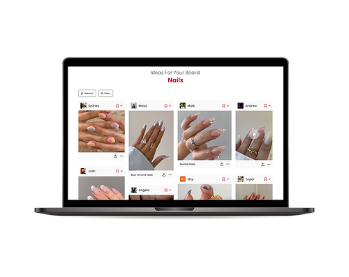
The categories section is something new I've implemented which is based on users' saved boards and interests, giving the user more control over their feed. In this wireframe, I've also depicted how sponsored ads and videos would show up. I made some changes from the lo-fi wireframe to the hi-fi wireframes as I noticed Pinterest's feed generally isn't sectioned out in rows like I've depicted in the lo-fi wireframe. I decided to make the layout of the feed look more organic and distinguish sponsored ads with a tag on the bottom left of the post indicating where the post will take the user. I've also ensured that the caption of any ads would state "Sponsored" before any supporting copy. To distinguish videos & stories from regular pins, I've just implemented a simple play button so users are aware that the pin is a video before clicking on it.


Following Page
The following page is something new I've implemented so users have the option to view pins from only from the people they follow on Pinterest. This was a big pain point that I initially assessed through user research as the current website doesn't provide a way to view pins from just the people you follow.


Final thoughts
Below are the final prototypes from this project. I've added some interactivity to show how the website would function and flow. In conclusion, this project was a great learning experience for me as it taught me how to consider several different perspectives and pushed me to think more critically on how I could design a more functional website.


